
Creating the perfect logo design isn’t just about aesthetic appeal—it’s about capturing your company’s essence in a visual element that will represent you for years to come. Your logo is often the first impression potential customers have of your business, making it one of your most valuable brand assets. With so much riding on this single design element, the pressure to get it right can be overwhelming.
Many business owners rush the logo design process, resulting in costly rebrands down the line when they realize their initial choice doesn’t align with their vision or scale properly across different platforms. This comprehensive guide will walk you through everything you need to know about selecting a perfect business logo that you won’t regret—from understanding the psychology behind effective logos to practical steps for working with designers.
Why Your Logo Matters More Than You Think
Your logo isn’t just a pretty graphic—it’s the cornerstone of your visual brand identity. Think about the world’s most successful companies: the Apple bitten apple, Nike’s swoosh, or McDonald’s golden arches. These simple designs have become so recognizable that they communicate brand values instantly without a single word.
A perfect logo design serves multiple critical functions:
- It distinguishes you from competitors in crowded marketplaces
- It builds recognition and memorability among your target audience
- It communicates your brand personality and values at a glance
- It establishes professionalism and credibility with potential customers
- It creates consistency across all marketing materials and touchpoints
Research by the Missouri University of Science and Technology found that visitors spend about 6.48 seconds focusing on a website’s logo—that’s precious little time to make an impression. This highlights why investing proper time and resources into creating the perfect business logo is essential rather than optional.
Understanding the Different Types of Logos
Before diving into the design process, it’s important to understand the different logo styles available so you can choose what best represents your brand. Each style has distinct advantages and communicates different brand attributes.
Wordmarks (Logotypes)
These logos consist entirely of text, typically your company name styled in a distinctive font. Think Google, Coca-Cola, or FedEx. Wordmarks work exceptionally well when:
- Your company has a unique or memorable name
- Name recognition is important to your business model
- You want to prioritize brand name recognition
Lettermarks (Monogram Logos)
These use initials or abbreviations of your business name, like IBM, CNN, or HBO. Lettermarks are ideal when:
- Your business name is long or complicated
- You want something more condensed than a wordmark
- You’re aiming for a clean, minimalist look
Pictorial Marks (Logo Symbols)
These are iconic, graphic-based logos without text, like Twitter’s bird or Apple’s apple. These work well when:
- You want a highly visual, instantly recognizable symbol
- Your business already has significant brand recognition
- You’re creating an international brand that transcends language barriers
Abstract Logo Marks
Unlike pictorial marks, these don’t depict recognizable objects but instead use abstract geometric forms to represent your business—think Pepsi’s circle or Adidas’s three stripes. These are powerful when:
- You want to create a truly unique visual identity
- You need a logo that can convey multiple meanings or feelings
- You want something that can evolve with your business
Mascots
These logos feature illustrated characters that represent your brand, like KFC’s Colonel Sanders or the Michelin Man. Mascots are effective when:
- You want to create a friendly, approachable brand personality
- Your target audience includes families or children
- You plan to utilize character marketing in advertisements
Combination Marks
These combine a wordmark with a symbol, giving you the best of both worlds. Examples include Burger King or Lacoste. These versatile logos are great when:
- You’re building a new brand that needs both name recognition and visual identity
- You want flexibility in how your logo is displayed across different media
- You need a logo that can be broken down into component parts
Emblems
These encapsulate your company name within a symbol or icon, like Starbucks or Harvard University. They work well for:
- Traditional industries or institutions that want to convey heritage and prestige
- Brands wanting to create a badge or seal of quality
- Organizations with a strong sense of community or belonging
Each of these logo types creates a different impression, so choosing the right style is a crucial first step in developing the perfect logo design.
The Psychology of Logo Design: Colors, Shapes, and Fonts
The most effective logos aren’t just visually appealing—they strategically use design elements to trigger specific psychological responses. Understanding these principles can help you develop a perfect logo design that resonates with your target audience on a subconscious level.
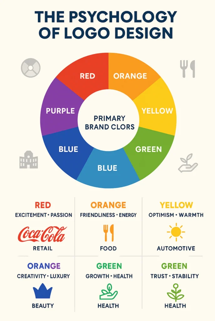
The Power of Color Psychology
Color choices can significantly impact how people perceive your brand:
- Red: Evokes passion, excitement, and urgency (think Coca-Cola, Netflix)
- Blue: Communicates trust, reliability, and professionalism (think IBM, Facebook)
- Green: Suggests growth, health, and environmental consciousness (think Whole Foods, Animal Planet)
- Yellow: Conveys optimism, clarity, and warmth (think McDonald’s, Best Buy)
- Purple: Represents creativity, wisdom, and luxury (think Cadbury, Hallmark)
- Orange: Expresses friendliness, enthusiasm, and energy (think Nickelodeon, Amazon)
- Black: Symbolizes sophistication, authority, and exclusivity (think Chanel, Nike)
Research published in the Journal of the Academy of Marketing Science found that color increases brand recognition by up to 80%. When choosing colors for your perfect logo for your brand, consider not only what resonates with your target audience but also what distinguishes you from competitors in your industry.
The Subtle Influence of Shapes
Logo shapes communicate different qualities about your brand:
- Circles, ovals, and ellipses: Suggest community, friendship, and unity
- Squares and rectangles: Communicate stability, balance, and professionalism
- Triangles: Represent power, science, religion, or legal associations
- Horizontal lines: Imply tranquility and calm
- Vertical lines: Suggest strength and aggression
- Curves and spirals: Evoke creativity and movement
The Harvard Business Review notes that shapes can trigger specific emotional responses even before conscious processing occurs. This makes your logo’s basic structure one of your most powerful tools for instant communication.
Typography Tells Your Brand Story
Font selection is far more than an aesthetic choice—it communicates fundamental aspects of your brand personality:
- Serif fonts (like Times New Roman): Traditional, respectable, established
- Sans-serif fonts (like Helvetica): Modern, clean, straightforward
- Script fonts: Personal, creative, elegant
- Display fonts: Unique, distinctive, expressive
- Slab serif fonts: Bold, confident, impactful
A study by Wichita State University found that fonts have measurable personalities that consumers intuitively recognize. The right typography can reinforce your brand messaging, while misaligned font choices can create unconscious disconnection.
7 Common Logo Design Mistakes to Avoid
Creating the perfect logo design isn’t just about knowing what to do—it’s also about avoiding critical mistakes that could undermine your brand. Here are seven pitfalls to avoid:
1. Following Trends Too Closely
Design trends come and go quickly. What looks cutting-edge today may appear dated within a year or two. Remember the late 2010s when every startup seemed to rebrand with the same sans-serif font? Many of those companies later had to undergo expensive rebrands to differentiate themselves.
Instead: Focus on timeless design principles that will keep your logo looking fresh for years to come. A truly perfect logo for your brand should have a lifecycle of at least 5-10 years before needing significant updates.
2. Designing for Yourself, Not Your Audience
Your personal preferences may not align with what appeals to your target market. Business owners often make the mistake of creating logos they love without considering whether those designs resonate with customers.
Instead: Conduct market research to understand the visual preferences of your target demographic. Use data rather than personal taste to guide design decisions.
3. Creating an Overly Complex Design
Intricate logos with multiple elements, gradients, and fine details might look impressive in isolation but often fail in practical applications. Complex logos don’t scale well to smaller sizes and are difficult to reproduce across different media.
Instead: Embrace simplicity. The most recognizable logos in the world—Nike, Apple, McDonald’s—are remarkably simple yet distinctive.
4. Lacking Versatility
Many businesses discover too late that their logo doesn’t work well across all needed applications. A logo that looks great on a website might be illegible on a business card or lose impact when embroidered on uniforms.
Instead: Test your logo across multiple contexts before finalizing. Ensure it works in color and black-and-white, at large and small scales, and across digital and print mediums.
5. Relying Too Heavily on Stock Graphics
Using stock images or templates as the basis for your logo virtually guarantees that your brand won’t stand out. These resources are available to everyone, including your competitors.
Instead: Invest in custom design work that creates a truly unique visual identity for your business.
6. Ignoring Cultural Connotations
Symbols and colors can have dramatically different meanings across different cultures. What seems perfectly innocent in one market might be offensive or inappropriate in another.
Instead: If you plan to operate internationally, research potential cultural implications of your design elements before finalizing your logo.
7. Designing Without Future Growth in Mind
As your business evolves, your logo needs to accommodate new product lines, services, or market positions. A too-specific logo can become limiting as you expand.
Instead: Create a flexible design system rather than a rigid logo that boxes you in. Your perfect business logo should have room to grow with your company.
The Essential Elements of a Perfect Logo Design
What separates good logos from truly great ones? After analyzing thousands of successful brand marks, certain patterns emerge. Your perfect logo design should incorporate these critical elements:
Simplicity
Leonardo da Vinci said, “Simplicity is the ultimate sophistication,” and nowhere is this more true than in logo design. The most effective logos communicate complex brand identities through remarkably simple visuals. Simple logos:
- Are more easily recognized and remembered
- Work better across various sizes and applications
- Stand the test of time better than complex designs
- Communicate more effectively at a glance
Memorability
The human brain processes images 60,000 times faster than text, but not all images stick in memory. Distinctive logos create strong neural connections through:
- Unique visual elements that stand apart from competitors
- Strategic use of negative space (like the arrow in FedEx)
- Unexpected twists on familiar symbols
- Visual puzzles or clever design elements that reward closer inspection
Relevance
Your logo should feel appropriate for your industry while still being distinctive. A children’s toy company with a somber, corporate logo creates cognitive dissonance, as would a financial institution with playful bubble letters.
Relevance doesn’t mean being generic—it means your perfect business logo should visually connect to your:
- Industry context
- Target audience expectations
- Company values and mission
- Product or service offering
Timelessness
Trends in design can make your logo look fresh initially but dated quickly. The most successful logos evolve subtly over decades rather than requiring complete overhauls. Companies like Coca-Cola, Shell, and IBM have maintained their core visual identities for generations while making minor refinements.
Versatility
Your logo will need to work across countless applications—some that may not even exist yet. A truly perfect logo for your brand functions effectively:
- At both very large and very small scales
- In color and black-and-white versions
- Across print, digital, physical products, and environments
- In both static and animated forms
- Against various backgrounds and contexts
How to Brief a Designer for Perfect Logo Design Creation
Working with a professional designer is often the best path to creating a perfect logo design, but the process begins with you providing clear direction. A comprehensive design brief saves time, money, and frustration by aligning expectations from the start.
Essential Components of an Effective Logo Design Brief
- Company Background and Mission Provide context about your business history, purpose, and future goals. Explain what problems you solve for customers and what makes your approach unique.
- Target Audience Definition Detail who your customers are—their demographics, psychographics, values, and pain points. The more specific you can be, the more targeted your logo design will be.
- Competitive Landscape Identify direct competitors and their visual branding. Explain what you like and dislike about their approaches, and how you want to differentiate your brand.
- Brand Personality Attributes Choose 3-5 adjectives that define your brand character. Are you professional, playful, cutting-edge, traditional, luxurious, accessible, or something else entirely?
- Design Preferences and References Share examples of logos you admire and explain why they appeal to you. Also include styles you specifically want to avoid.
- Application Requirements List all the places your logo will need to appear, from business cards to building signage, social media profiles to product packaging.
- Timeline and Budget Be upfront about your constraints so designers can work within your parameters.
A sample brief section might read:
"We're a boutique financial advisory firm called 'Clarity Capital' that specializes in helping first-generation wealth builders navigate investment options. Our target clients are entrepreneurs ages 35-50 who have recently experienced financial success but feel overwhelmed by complex financial systems. Our brand personality is trustworthy, accessible, and forward-thinking. We want our logo to convey stability without feeling stuffy or traditional like most financial institutions. The logo will primarily appear on our website, business cards, and office signage."
This level of detail gives designers the context they need to create truly tailored options for your perfect logo for your brand.
The Logo Design Process: What to Expect
Understanding the professional design process helps you collaborate more effectively with designers and appreciate the work that goes into creating a perfect business logo.
Research Phase
Before creating a single sketch, good designers immerse themselves in understanding:
- Your industry and its visual conventions
- Your competitors’ branding strategies
- Your target audience’s preferences and expectations
- Current design trends and timeless principles
- Your brand’s unique positioning and values
This foundational work ensures the design solutions aren’t just visually appealing but strategically sound.
Conceptualization and Sketching
Designers begin by generating numerous rough concepts—often dozens or even hundreds. This exploratory phase prioritizes quantity over quality, allowing creative connections and unexpected solutions to emerge.
These initial sketches are typically done by hand, as the speed and flexibility of pencil and paper support the rapid generation of ideas before any digital tools are introduced.
Digital Development
The most promising concepts are then refined digitally, where precision, color, and typography come into play. Designers typically develop multiple directions rather than putting all efforts into a single solution.
At this stage, designers consider technical requirements like:
- Scalability across different sizes
- Color variations, including black-and-white versions
- Various application contexts
- File format needs for different media
Presentation and Feedback
You’ll typically be presented with several strong options rather than a single solution. Each concept should be shown in context—mocked up on business cards, websites, or other relevant applications.
Effective feedback at this stage focuses on how well each option meets the strategic objectives rather than subjective preferences. Questions to consider include:
- Does this logo communicate our brand personality?
- Will it resonate with our target audience?
- Does it differentiate us from competitors?
- Will it remain effective as we grow?
Refinement and Finalization
Based on feedback, the chosen direction is refined. This may involve adjusting proportions, fine-tuning colors, or tweaking typography to create the final version of your perfect logo for your brand.
The deliverable package should include multiple file formats, color variations, and usage guidelines to ensure consistent application across all touchpoints.
DIY vs. Professional: Making the Right Choice for Your Budget
Not every business can afford top-tier design agencies, but there are options at various price points for creating a perfect business logo. Here’s how to make the best choice for your circumstances:
When DIY Makes Sense
Creating your own logo might be appropriate when:
- You’re in the very early startup phase with minimal funds
- You have genuine design skills and software proficiency
- Your business is a small, local operation with limited customer touchpoints
- You’re creating a temporary logo while saving for professional design
If you go the DIY route, leverage these resources:
- Logo maker tools like Canva, Looka, or Tailor Brands
- Design courses on platforms like Skillshare or Udemy
- DIY design books focused specifically on logo creation
- Free typography resources from Google Fonts
Remember that even with DIY approaches, you should still apply the fundamental principles of effective logo design.
Budget-Friendly Professional Options
For businesses with limited budgets but who recognize the value of professional input:
- Freelance designers on platforms like Fiverr or Upwork (expect to pay $200-500 for quality work)
- Design students nearing graduation who need portfolio pieces
- Small local design studios that may offer startup packages
- Logo design contests on sites like 99designs
These approaches cost more than DIY but significantly less than established agencies while still providing professional-level results.
Full-Service Agency Benefits
For established businesses or those with ambitious growth plans, agency partnerships offer:
- Strategic brand positioning beyond just logo design
- Comprehensive market and competitor research
- Multiple senior designers contributing ideas
- Extended brand identity systems beyond the logo
- Brand guidelines for consistent implementation
- Ongoing support and evolution of your visual identity
Agency work typically starts at several thousand dollars but creates foundational brand assets that can deliver value for many years.
Making the Final Decision
The right approach depends on:
- Your business growth stage and future plans
- The competitive landscape of your industry
- Your target audience’s expectations
- Your available budget and timeline
- The complexity of your branding needs
Whatever your budget, remember that your logo is an investment rather than an expense. A perfect logo for your brand pays dividends through stronger customer recognition, enhanced professionalism, and clearer market positioning.
Testing Your Perfect Logo Design Before Finalizing
Before committing to your logo design, testing it with objective measures can help ensure you’ve created the perfect logo design that will serve you well long-term.
The 5-Second Test
Show potential customers your logo for just five seconds, then ask what they remember about it and what impression it gave them. This mimics real-world conditions where consumers often only glance at branding momentarily.
Effective logos create immediate recognition and appropriate emotional responses even with brief exposure. If people can’t recall your logo or misinterpret its meaning after five seconds, it may need refinement.
The Scalability Test
Print your logo at various sizes—from as small as 0.5 inches to as large as your printer allows. Also view it on different screen sizes from phones to desktops.
A truly perfect logo for your brand maintains its integrity and legibility across all these contexts. If details become muddy or text becomes unreadable at certain sizes, revisions may be necessary.
The Black-and-White Test
Convert your color logo to grayscale and pure black-and-white versions. While color enhances branding, strong logos work effectively even without color. This test is particularly important because your logo will inevitably appear in monochrome contexts sometimes.
The Context Test
Mock up your logo in the environments where it will actually appear—on your product packaging, website header, social media profile, business cards, and any other relevant applications.
Sometimes logos that look great in isolation don’t work as well in practical contexts. This testing stage can reveal integration issues before they become costly problems.
The Memory Test
Show a group of people your logo, then ask them to draw it from memory an hour later. While they won’t reproduce it perfectly, this test reveals which elements are most memorable and which might be unnecessarily complex.
The Competitor Differentiation Test
Display your logo alongside your top competitors’ logos and ask test participants which stands out and why. Your perfect business logo should be distinctive enough to be immediately identifiable even in a crowded visual field.
The Longevity Test
This is more subjective, but ask yourself and others: “Will this logo still feel relevant in 5-10 years?” Try to distinguish between trendy design elements that may date quickly and more timeless approaches.
Implementing Your Logo Across Your Brand
Once you’ve finalized your perfect logo for your brand, consistent implementation is crucial for building recognition and professional credibility.
Create a Logo Usage Guide
Even small businesses benefit from simple brand guidelines that establish:
- Minimum size requirements
- Clear space around the logo
- Approved color variations
- Backgrounds the logo can appear on
- Incorrect usages to avoid
This documentation ensures everyone who touches your brand materials—from employees to vendors—applies your logo correctly.
Prioritize Implementation Touchpoints
Most businesses can’t update everything simultaneously, so prioritize customer-facing elements:
- Website and digital platforms
- Social media profiles
- Email signatures and templates
- Business cards and stationery
- Signage and physical locations
- Product packaging
- Marketing materials
- Internal documents
This phased approach makes the transition manageable while focusing on points of maximum customer impact.
Announce Your New Logo
If you’re replacing an existing logo, the change represents a marketing opportunity. Develop a simple communication strategy that:
- Explains the thinking behind the new design
- Connects the visual evolution to your business evolution
- Thanks customers for being part of your journey
- Creates excitement about your brand’s future
Even subtle logo refreshes benefit from acknowledgment, as this demonstrates intentional brand management.
Monitor Application Consistency
Even with clear guidelines, inconsistencies inevitably emerge. Implement regular brand audits to check how your logo appears across different channels and correct any deviations.
This vigilance maintains the integrity of your perfect logo design and maximizes its impact on audience recognition.
When and Why to Consider a Logo Redesign
Even the most carefully crafted logos sometimes need refreshing. Understanding when to evolve your visual identity helps maintain brand relevance without abandoning equity you’ve built.
Signs Your Logo May Need Updating
Consider a logo redesign when:
- Your business has significantly evolved beyond its original scope
- Your current logo doesn’t work well across digital platforms
- You’re repositioning to attract a different customer segment
- Your logo looks dated compared to contemporary competitors
- You’re recovering from reputation issues and need a fresh start
- Your logo was created with limited resources during startup phase
- Your company has merged or been acquired
Evolution vs. Revolution
Logo updates exist on a spectrum from subtle refinements to complete overhauls:
- Refinement: Maintaining the core elements while modernizing details (like Shell’s gradual shell icon updates)
- Evolution: Preserving recognizable elements while making significant updates (like Starbucks simplifying their mermaid icon over time)
- Revolution: Creating an entirely new visual identity (like when Apple abandoned their rainbow apple for the monochrome version)
The appropriate approach depends on your specific circumstances and how much brand equity resides in your current design.
Managing the Transition
When updating your logo, consider:
- The timing relative to other business changes
- How to communicate the change to customers
- Whether to implement changes all at once or gradually
- Legal requirements for updating branded materials
- Budget implications across all touchpoints
A thoughtful transition plan prevents confusion and leverages the update as a positive brand story rather than a disruption.
Conclusion
A logo is far more than a visual mark—it’s the cornerstone of your brand’s identity, blending artistry with strategic purpose to create instant recognition and lasting customer connections. The most impactful logos evolve alongside your business, balancing simplicity, versatility, and relevance while reflecting your core values.
At LegendaryIdeas, we specialize in designing logos that grow with your brand. Our process merges creative innovation with market-tested strategies, ensuring your logo:
- Communicates your story at a glance.
- Adapts seamlessly across platforms and future ventures.
- Strengthens loyalty through cohesive, memorable design.
Why navigate this complex journey alone? Let our team of branding experts craft a logo that’s not just visually striking but a strategic asset—one that fuels recognition, trust, and growth.
How to Create a Brand Style Guide That Actually Works - Legendary Ideas
May 5, 2025[…] Primary logo specifications and variations (horizontal, vertical, icon-only) […]